
 Hi guys, Hope you are doing great! Today I would like to talk to you about freedom of choice. Let’s say that you are launching a new startup. At this stage, the primary channel of promotion would be email marketing. The goal of any campaign is a committed action, such as a click-through. But no matter how hard you try to tempt existing and potential customers with new promotions, creative content and discounts, there always will be people who wish to unsubscribe unwanted emails. In order to send newsletters only to interested people and not to get spam complaints, add the button with unsubscribe link into your email.
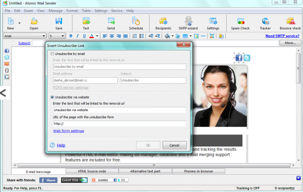 Adding an unsubscribe link to an email
 A small unsubscribe button at the very bottom of the email And even if you find the button, it may not be the end. You may come across such a complex procedure that successfully unsubscribing without a university degree can be a hard one. For example, the unsubscribe process provided by one of car rental services is rated as one of the worst ever.
 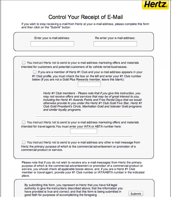 The really difficult process of opting out Marketers have to understand that hiding the Unsubscribe button doesn’t solve a problem. When a person decides to opt out, hiding this option will lead that user to hit the Spam button. If you have dealt with email marketing, you should know that the more spam reports your provider receives, the smaller the probability is that your email will get to the client’s inbox in the future. Clients shouldn’t wonder how to unsubscribe to emails. Make this process as easy as possible. The easiest way to make the Unsubscribe button more user-friendly is to place it at the very top of the letter. So, there will not be a question where’s the unsubscribe button. One promotions site places this button right at the top of its newsletter. When you hit the button, there is no complex procedure or forms to fill out. You just hit the button and that’s it. Funny approach along with the simplicity never better increases customer loyalty.
 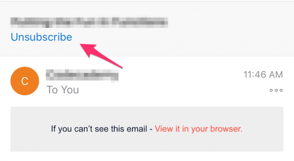 How to put an unsubscribe link in an email for users to see it at once You can say that easy unsubscription is a risky enterprise, and you would be absolutely right. But taking this risk is much more rational than leaving your clients no other choice than hitting the Spam button. Once someone tries to unsubscribe from your email newsletter, you can take different approaches to leave him on your subscription list:
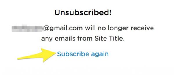 The offer of re-subscription on the unsubscription page
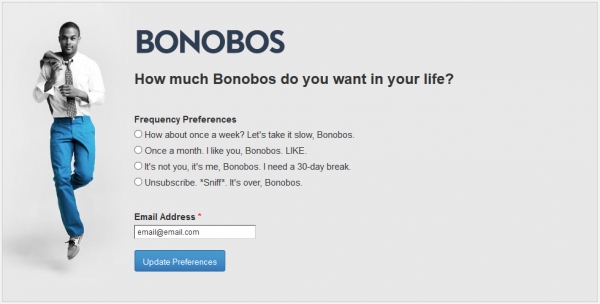 The web-page on which a client can change the frequency of emails receiving


Subscribe to us and you will know about our latest updates and events as just they will be presented


