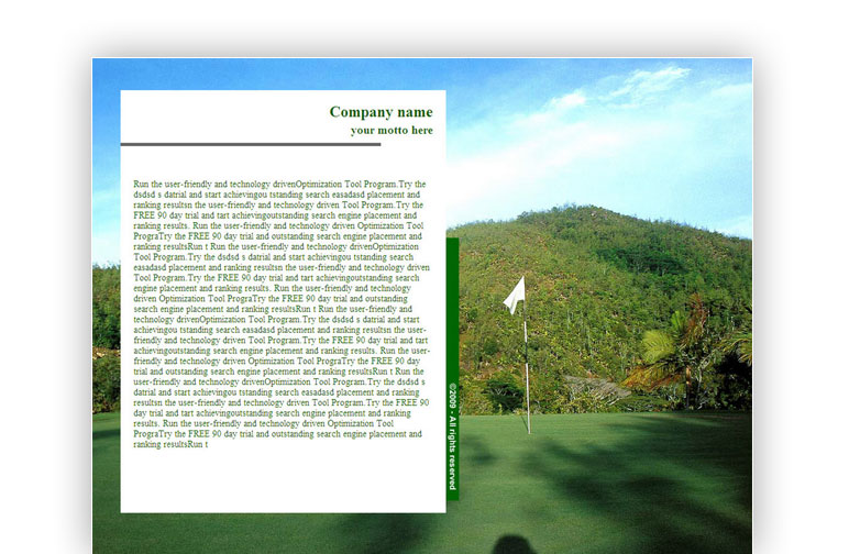
You’ve decided to send up-to-date email campaigns and stand out from the crowd of email messages. Finally, you made a decision to use a unique, eye-catching design for your mailings. That's great, and congratulations! We recently talked about attractive email signature, today we are going to talk about the right design of an entire email and how to create an email template that is both pleasing to the eye and efficient in terms of conversion.
So, let's start…
A high priority of email template design lies in recognizability, because your template should inherit (but not duplicate) your website design. If you want to get an email template that differs from your website style, or a topical template (a greeting card template for a holiday, and so on), please let us know via email.
Though your email message is an HTML page that is similar to your site, this email will have some differences, imposed by technical requirements:

A very large background image is a point of issue.
Your email template is a designed and structured frame for your email message. You can add and change text content yourself, and use this template for multiple mailings. However, there are some nuances you should know to avoid having your e-newsletter fall into recipients’ spam folders:

Do not try to fill a single email message with a full load of information about you and your company (for example, price lists, news, activity description, links to related articles, and so on). Theoretically, your email message should fit on one screen. Be smarter — build your email marketing strategy in the best way, placing the most interesting content on the first place, and a recipient will notice it. Divide your information into multiple mailings and form a series of email campaigns. Send actual prices only, and favorable offers.
Once again, we want to direct your attention to the fact that you cannot use Javascript and iFrames in your email messages. In order to add a video, a simple preview is used, and wrapped into a link. This kind of video will be displayed in a new browser window, in a pop-up window, or under the message, depending on the recipient's email client.
Do you want to get feedback and your subscribers’ personal data? What should you do for this? Of course, add a form. But you again need to restrict yourself to the main requirements of email messages. This may be the simplest form that you can generate using HTML code; but without verifying data correctness, without an error message, cryptographically unsafe, and with open data transmission. It goes without saying that the form handler should be placed on your website.
Have some empathy for your recipients – do not make them take such a risk. It would better to add a noticeable button that is linked to a webpage with your form.

Each sphere of technology continues progressing from day to day, and email message design also gets innovations. More and more e-newsletter recipients view letters using mobile devices, smartphones, and tablets. Want to be in step with the times? The following rules will help you to stay up-to-date:
And remember that we are always glad to help you get the most out of our products. Make valuable and effective e-newsletters!
Want to send an originally designed newsletter? Order an html email template. We also create email templates that are freely available to people who use our bulk email sender.


Subscribe to us and you will know about our latest updates and events as just they will be presented


