Imagine, you have a shop with computers and there is a new model. The new product isn’t just an opportunity to get money, but also a great chance to leverage brand recognition and reputation or ruin it. Everything depends on advertising and presentation.
That’s why think how to promote the product to sell it and not to spoil the brand reputation. Instead of jumping at handing out flyers, that will face the nearest garbage can, think of more perspective ways to promote it. Mass mailing campaign, advertising emails, for example.
The choice is yours, but we advise to move with the times and create a promotional email. From this article you find out how to structure a promo email, what header, email body, product card and CTA should be.
Read the article to reveal the secrets of crafting a promo email that sells & find out how to improve email open rates.
Promo emails are messages in which products are promoted to increase sales.
It is one of the various methods:
The well-done promotional newsletter can convert subscriber to a regular customer. Furthermore, you should remember the main rule — the relations with the customer is more important than sells. How to improve writing emails?
It is a real challenge to combine your goal to sell and to accommodate the client’s interest.
Email marketing is a delicate affair that can’t be rushed.
One of the biggest marketer’s problems is neglecting the fine line of newsletter and promo emails — not try to sell in each email. Let’s deal with it together.
You should keep the formula of an email depends on its type.
Your customers don’t want to hear about the products all the time, they also need to get useful information without advertising.
In the promotional email is permitted 90% of advertising and up to 10% of the information, in service — vice verse.
Let’s see it in practice. This an example of the informational email & examples of promotional emails:
Framebridge sells pictures and framework. In the email, the company teaches how to hang a picture. It connects with the sphere of its business that shows care about customers and professionalism.
This is another example of a promo email:
The main idea оf this email is to promote products and inform clients about buying conditions.
The burning desire to increase sells clouds judgment and marketers put BUY-button in each email, despite its purpose. For example, the user gets an educational email in which is told English grammar in tables and at the end of the newsletter is CTA ‘“Start shopping”. It calls a bit of misunderstanding.
Remember:
Let me give some examples:
This is email news digest and it has one CTA button to watch the news. In the email, all demands are met.
Let’s see different email:
Domino — the company, that sells goods for home, decided to combine the informational and promotional email newsletter. The first part has some cases for design and CTA button is relevant — SEE MORE. Furthermore, the email promotes products and CTA is BUY NOW. But one of the most rules of the CTA button and email structure at all is not to overdo. In this email are two opposite types of CTA and there are 31 buttons! The creator neglects rule: one email — one goal. Remember it and don’t repeat such a mistake.
One more email:
It is a typical promo email. It promotes two products with a discount, and the price is mentioned. Furthermore, there are two same CTA buttons. General rules of email are met. The newsletter is really good.
To protect you from these mistakes we give the variants of CTA depends on email’s type.
|
Service email |
Promotional email |
| Watch/Read more | Start shopping |
| See now | Buy now |
| Start learning | Buy with the discount |
| Join us | Want it? |
You should adhere to these main differences if you want to be a safe pair of hands for the customer.
I believe, that you remember generally accepted rules, such as well-design email, GDPR, unsubscription form and others. Now I give you a detailed guide on how to create promo emails.
Each email newsletter despite the type consist of 4 part:
Let’s deal with these elements once by one.
How to improve email click through rate? Email title is the cover of the candy that influence the decision to eat it or not.
We’ll collect some examples that awoke your creativity and help to write right subject lines of promo emails.
Moreover, remember about spam words in email blasting, that decrease the email chance to get into Inbox. For example:
| 100% free | Free gift |
| At no cost | Increase sales |
| Best price | Luxury |
| Be your own boss | Millionaire |
| Casino | VIP |
| Discount | Zero risk |
There is not a full list of words, but you can check the email with the help of Spam Assassin in the Atomic Mail Sender.
Creating the subject line is a labour-intensive process and you can’t neglect it. If it is a good one and the user opens an email, the chance for purchasing will increase.
The header is a part of an email, in which some information is mentioned:
It goes before an email body.
If we are talking about header in a promotional email there is no universal formula, but there are three traditional elements of the header: logo, Sender ID, menu.
Logo and Sender ID in promotional email
How to write an email to a company? As a rule, the company’s name is a part of the logo, but it depends on the company’s popularity.
If the company is a newcomer, and customers just become familiar with your product, you should include its name and logo — the visit card.
If the brand is well-known it is possible to add the only logo, that clients have identified yet.
Let’s pay attention to the sales promotion email sample:
HomeAway includes both the company’s name and logo to the header.
Process Type Foundry uses the only logo.
Menu
It helps customers to look for the website.
Pretty Dresses include a menu to the header.
Social icons
It is a good practice to add social network icons to the email header. It helps to increase the number of subscribers.
For example, Designmodo adds icons of Facebook and Twitter.
Information about discounts or a special offer
In promotional emails, it is important to show the customer’s profit.
If you’ve prepared eye-catching subject line and addressee opens it, you should emphasize a thing, that the user will get.
The first element of the header in an email is the promo code for free shipping. Such an approach involve clients and there is a high probability that the customer starts shopping.
These examples don’t tell that you must add all possible elements. According to these promotional email example, you can experiment with a header in promo emails and come up with own ideal formula.
From the body in a promotional email depends on whether a customer makes a purchase or not.
Description of the product and CTA button are the most important because these elements are the face of the product and should work together to encourage customers.
Product card in promo emails
It is a detailed description of the product’s features with such elements as price and CTA button.
Creating a promotional email you should plan the structure: where and what product card will be. Unfortunately, there isn’t an ideal template of promotional email, because such doesn’t exist. We’ll reveal secrets that tell you how to write a sales promotional email.
Let’s start!
The product card has some binding rules, that you can’t avoid.
Image of the product. It is its face and it should:
Let's see the best examples of promotional email:
In this email promote new iPhone and propose to pre-order it. Pay attention to the photo: it demonstrates all sides, different colours, and separate elements.
The product name
You can place it above or to the right of the photo. As practice shows, people scan monitor from left to right, starting from the top left corner. That’s why the most convenient place to write the product’s name is top left. You can also place where you want but remember about readability and email design.
Nike places the name of shoes under the photo. The brand means that it makes a focus on product’s look. Further, the fans of Nike know its name.

Apple sends an email in which the product’s name is the first thing that you see.
Description of the product
This part must answer the customer’s questions: “What benefits will I have?”, “Why should I buy it?” The description should:
For example:
In the description of products, IKEA shows benefits for clients and price. Pay attention to email structures: each good has own zone.
One more example:
This email hasn’t a detailed description of products, only name and doesn’t show price, only the discount. But it has categories that help to guide users.
The Golden Bear promotes jackets from the limited collection that are with discounts. The description with advantages, the product’s name and price are mentioned.
The CTA button in promo emails
Higher we gave you advice, let’s expand it.
The successful CTA doesn’t operate independently. It seems to be the culmination of the persuasive story.
Let’s down with boring text of CTA, try to change the traditional approach and create the best CTA in the history of email marketing.
Let’s refresh our minds by these ideas:
Let’s see how it is on practise:
The CTA button is visible, well-designed, but hasn’t a personalized word.
The email has the same buttons. It is created in contrast colour and awakes to harry up.
There are the ideal CTA because it depends also on email type and brand, but these tips help you to create the most appropriate button according to the purpose.
Footer in promo emails
The last but not the least.
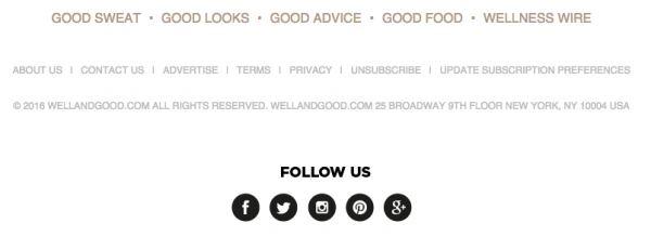
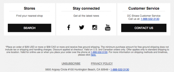
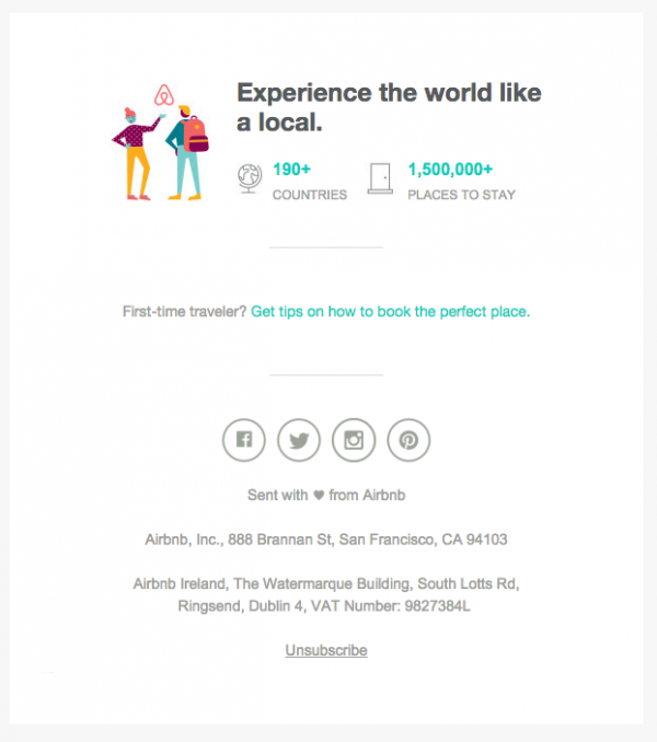
Footer is an end of every email. Despite the footer is the last element, you should also make it perfect and we help you with this task. Elements that can be included:
Design of the footer in the promotional email should:
Forget about strange shapes, images and colours. Beauty is simplicity. The footer can’t be bigger than the email body that’s why think what information is the most important and include only binding info.
Place the most important in the first place. Focus the customer’s attention on things that they are interested in.


The elements in footer should be separate from each other, that’s why don’t economize the space in promo emails.

The footer is concluding part of the email. If you want to make not only the first impression but also leave the most lasting impression, you should make efforts to create the footer.
Searching the Internet or email hunting, I haven’t seen the ideal promo emails. However, with our tips, you will create the best promotional email in marketing history. Use Atomic Mail Sender as your ideal tracking email software and practise your knowledge with the help of our program.


Subscribe to us and you will know about our latest updates and events as just they will be presented


