I will not repeat that CSS is a language for describing the appearance of an HTML document. You already know that. But what is the real use of CSS inlining in email marketing?
While HTML structures the content and layout, CSS inlining in email is used to style and format the content like including link colors and headline fonts.
With the combination of CSS and HTML elements, we get such email newsletter masterpieces like:
Did you like it? Of course, you do?
Certainly, the result of the designing such email campaign will be gorgeous but is it worth it?
Let's find out!
Email clients are unpredictable. Using CSS elements in designing email you can:

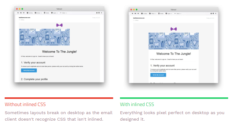
What happens if you don’t inline your styles? The styling in the body of your email will not display in clients like Gmail.
Here is how this email displayed with the inline CSS:
Trending tips of how and why brands create interactive elements using CSS in email marketing 2018.
I think you know the rule about the perfect email newsletter length - it should be visual short with only 2 scrolls long. But how to keep this rule when you have to tell so much?
Clever email developers came up with lifehack how to visually shorten a long e-mail with the help of the accordion effect.
Just like the musical instrument accordion, using of interactive design element – Accordion helps collapse and expand sections of the email based on user interaction.
Roughly 80% of the popular email clients will support the email with this effect so there are no problems with its displaying.
Using Accordion effect you can dramatically reduce the email length without compromising on the email copy.
There are some more advantages of adding Accordion CSS to email campaigns:
CSS animation is a method of animating certain HTML elements without having to use processor and memory-hungry JavaScript or Flash.
Top reason to use it in emails:
Here is a great example of using CSS animation in email promotion of Annabelle Creation movie:
This is a demonstration of cycling through a series of content, built with CSS transforms and a bit of JavaScript. It works with a set of images, text, or custom markup.
The technical side:
Litmus shared its experience in one of its articles - “We used the radio buttons hack to create HTML and CSS click events where each article was its own "slide" tied to a radio button. The contextual logic hides and shows each slide article content based on if its corresponding radio button is checked.”
The visual side:
Here is an example of how the company uses CSS slider gallery in one of its email campaigns:
Benefits of CSS Sliders in the design of email newsletter:
Here are some additional design best practices of the 2018 year for building successful HTML emails you shouldn't miss:
One of the rare examples when the carousel effect worked in the newsletter without delays and failures.
Want more useful info about CSS emails? Write your wishes in comments and we will supply you with more samples and details of designing such newsletters.


Subscribe to us and you will know about our latest updates and events as just they will be presented


